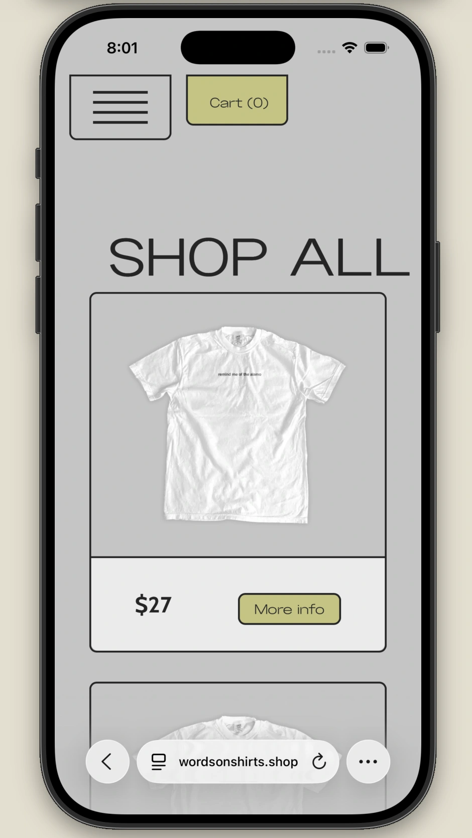
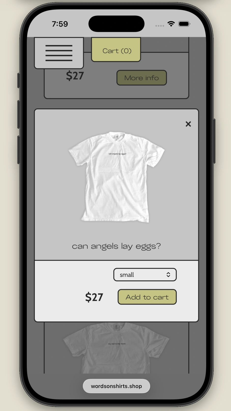
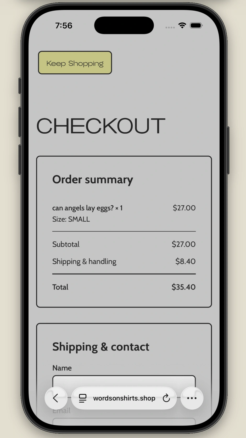
Developed as part of a larger music campaign, the shop treats its inane product with total self assuredness, pairing a restrained visual system with a frictionless buying experience.
Recorded from the live interface.
Role
Concept, art direction, UX/UI, development
Scope
E-commerce / campaign extension
Approach
Straight face. Clear function.
The concept
Doing too much.
Words on Shirts starts with an almost unreasonable commitment to its
own premise. The design challenge was to carry that voice all the
way from the first impression to the details of choosing a product.
A spare grid and matter-of-fact typography make the product the main
event. The personality comes from timing, copy, and tiny moments of
interaction rather than layers of decoration.
The entire business propositionA straightforward shopThe details, without the detourA clear path through checkout
Interaction detail
Minor decisions, visible feedback.
Same shirt, different screen.
The composition adapts. The personality stays. A few moments from
the mobile experience.
Commitment to the bit
Constraint can be a useful source of character. The appeal of Words on Shirts stemmed from a reference made in an artist’s song, so the intrigue of this site depended on its withholding any attempt to defend the product’s existence. Designing as though a consensus should be apparent as to the logic of the product’s existence allowed room for the visual presentation to take center stage.