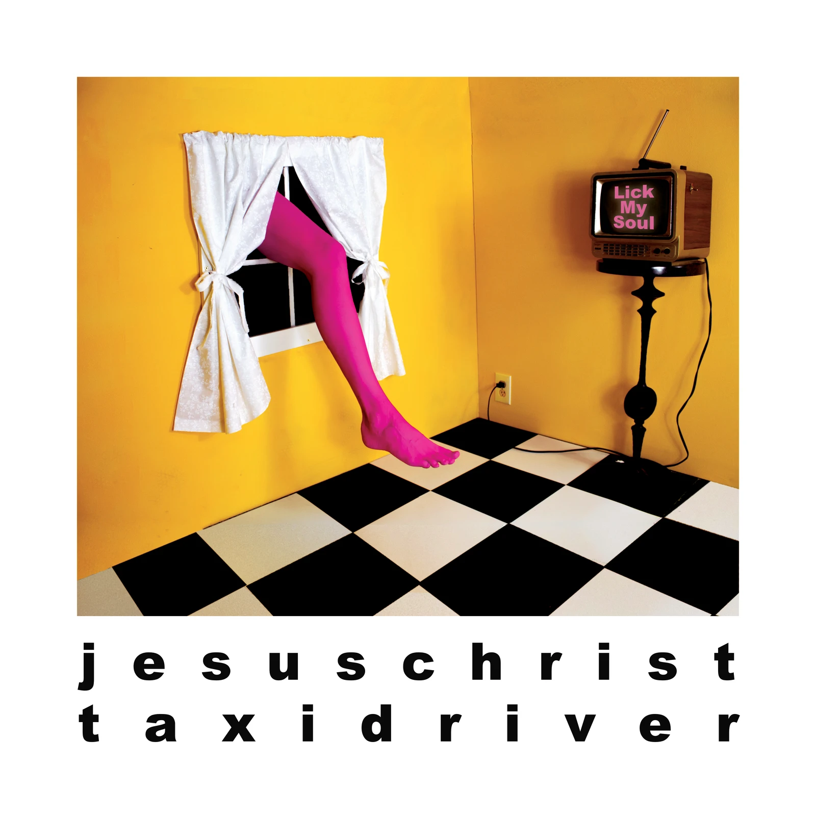
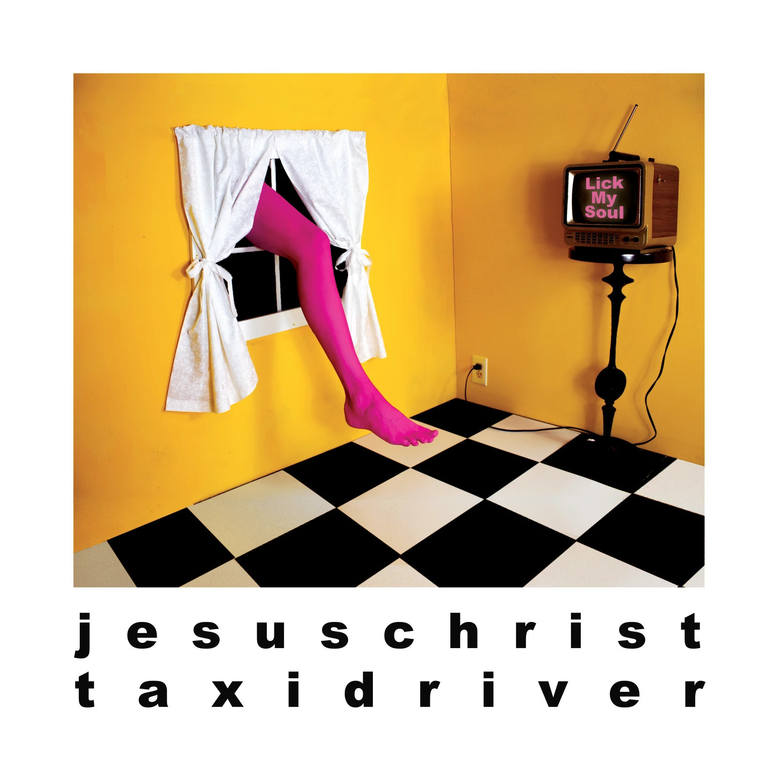
A reliance on practical effects quickly presented itself as an important conceptual waypoint in this campaign. Even where digital augmentation would have been faster or easier, relying on tangible material construction was yielding results that felt more spontaneous and organic, because the process by which we arrived at them had been.
Jesus Christ Taxi Driver
Making it
make sense.
An album campaign built through experimentation, collaboration, and a willingness to follow any idea until it became worthwhile.
- Role
- Art direction / visual identity / graphic design
- Scope
- Campaign / packaging / merchandise / release artwork
- Approach
- Yes, and...
The process
The feeling was real
The feeling was real
(And so was the room)
Letting the direction
define itself.
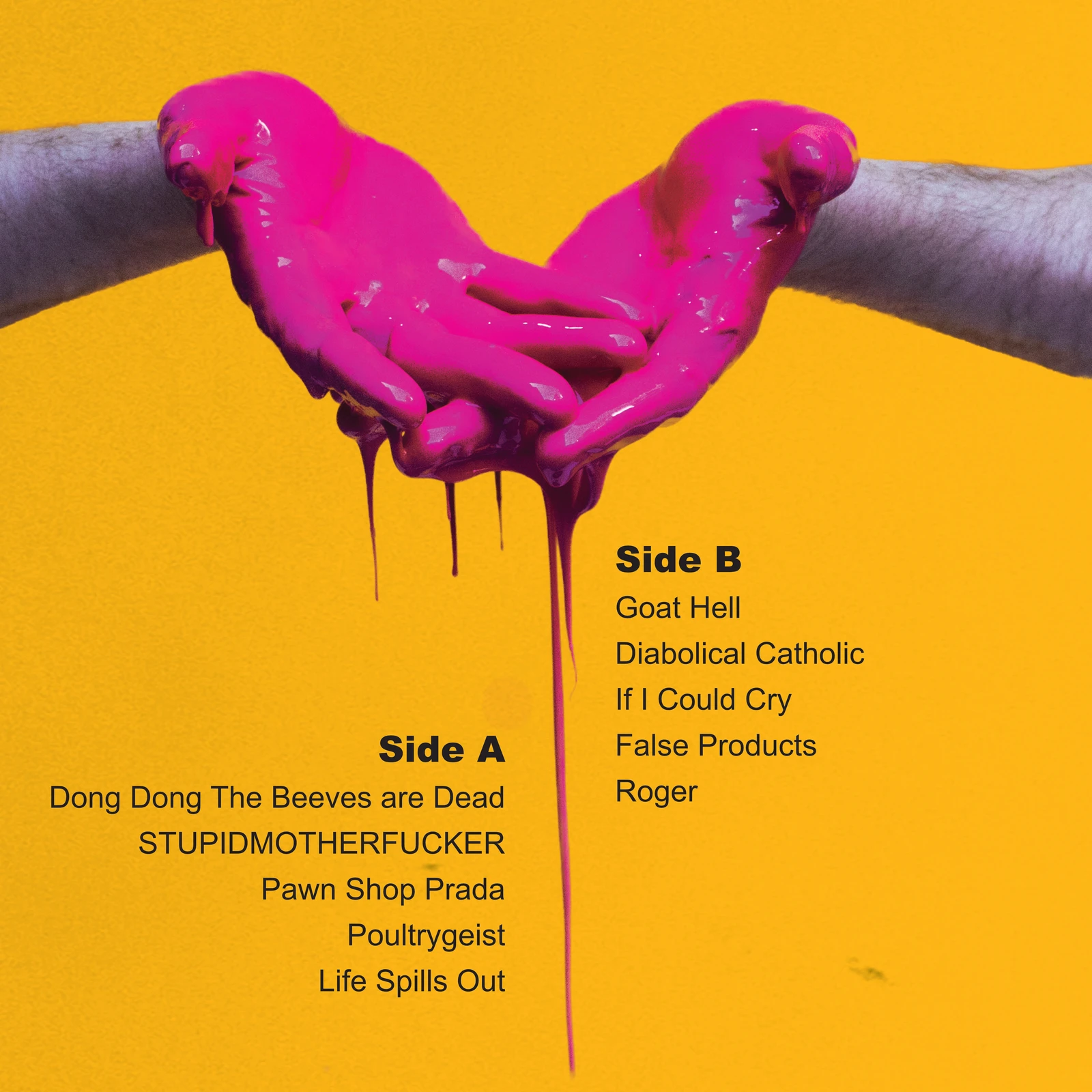
What began as a handful of instinctual visual decisions gradually became a world. It developed in practice, and in conversation with the artist, one decision at a time. We made things, and when we got to a result we liked, we adopted that result’s process as a rule for the art direction moving forward.
Wearing it home.
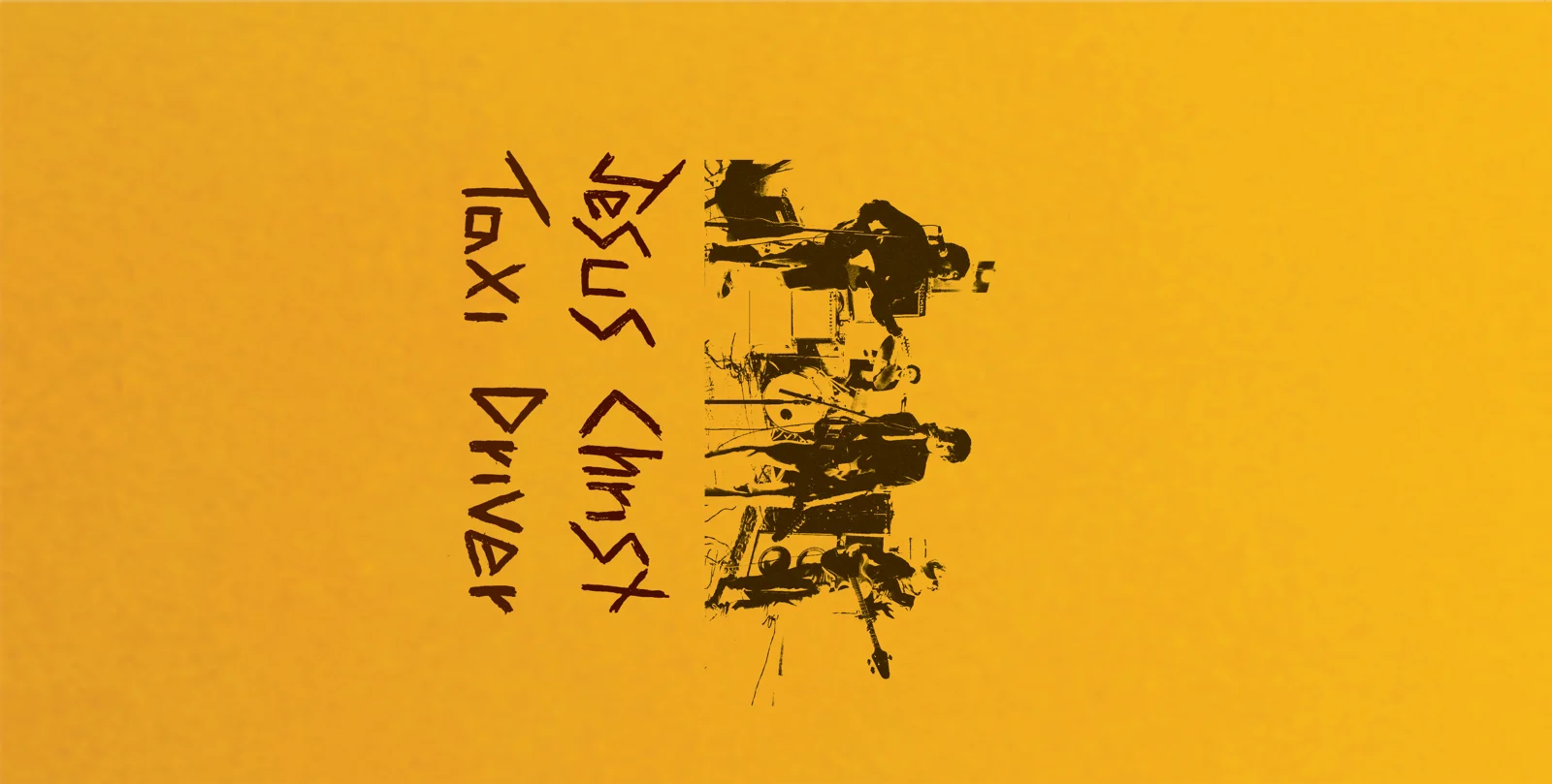
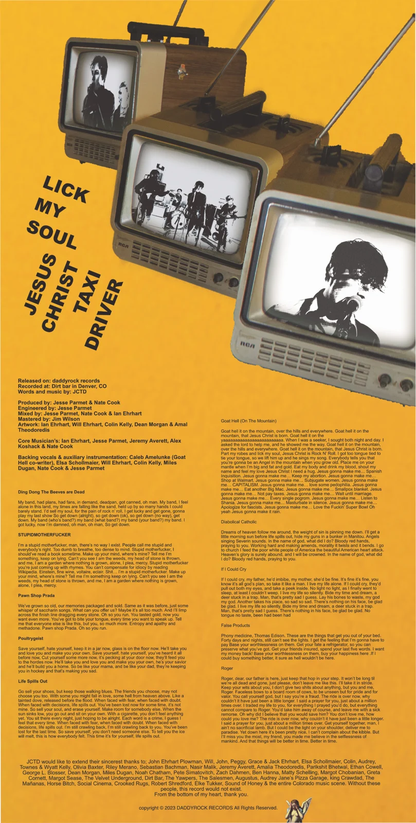
The visual language is continued across merch designs by using elements of the artwork, or in some cases the cutting room floor scraps from the artwork, without simply repeating it.
I don’t think a visual identity always needs to know exactly what it is before you start working from it. Given enough attention, and enthusiastic collaboration, sometimes the better option is to let it reveal itself. The consistency in this campaign came from following what worked, staying flexible about what came next, and trusting that good decisions could teach us the rules as we went.
Next project / 05
Teething ↗︎