This campaign started with a rule: the objects themselves should not be strange. A chair, a bowl of cereal, a wind-up novelty toy, a T-shirt, a filing cabinet. The finished images should feel unsettling, but it had to rely on the relationships between these familiar objects represented within each image.
Teething
Nothing out
of the ordinary.
A visual campaign for The Yawpers. Built almost entirely from familiar objects, but with a tension that comes from misplaced context, repetition, and implausible assembly.
- Role
- Art direction / artwork / graphic design
- Scope
- Album identity / vinyl / social / tour
- Approach
- The everyday, made unrecognizable.
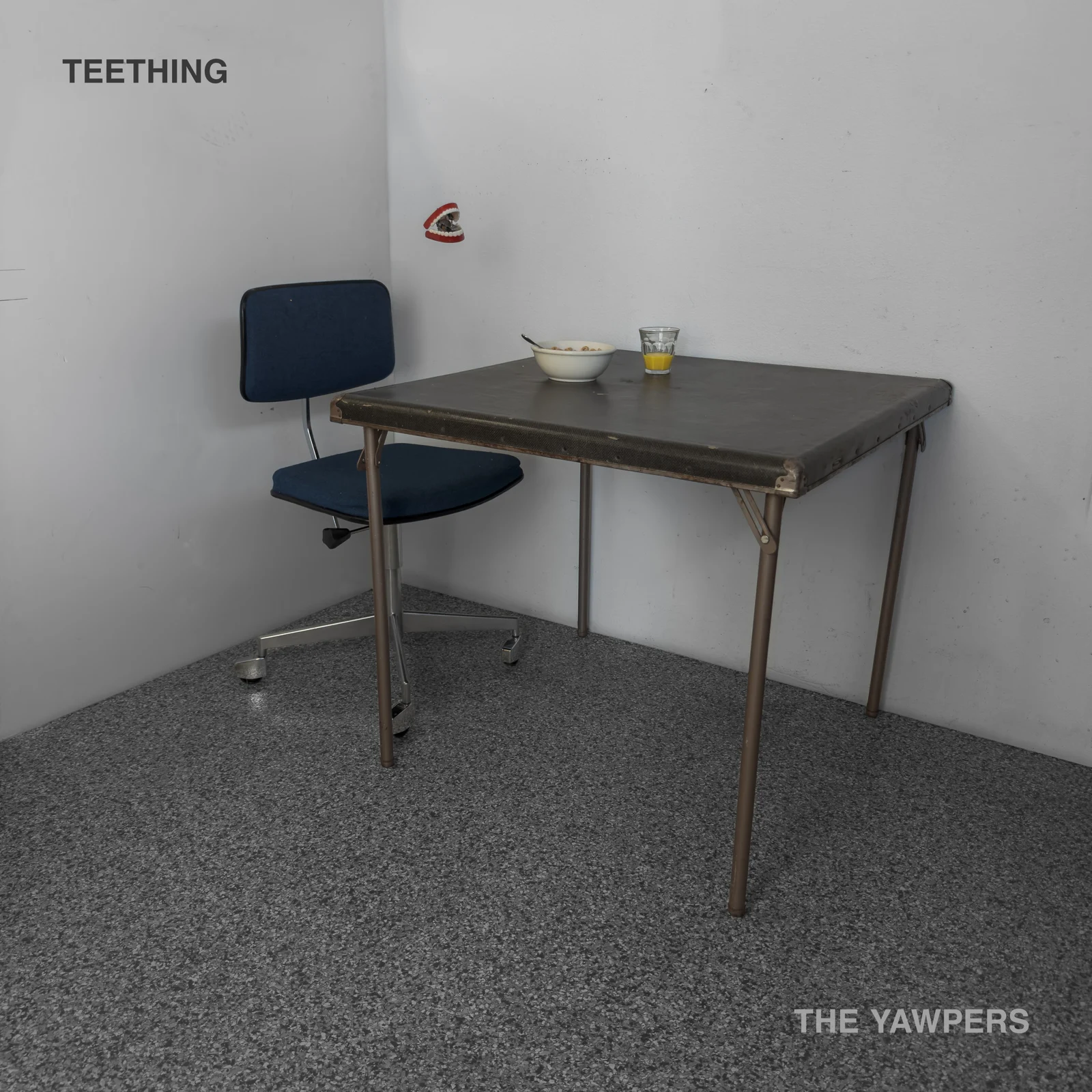
The concept
Find the tension in something mundane.
Designing the physical record.
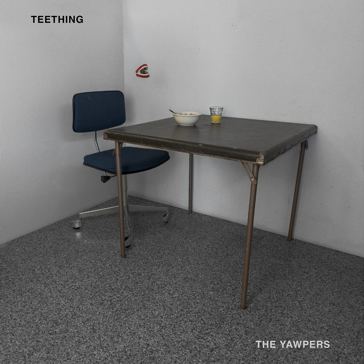
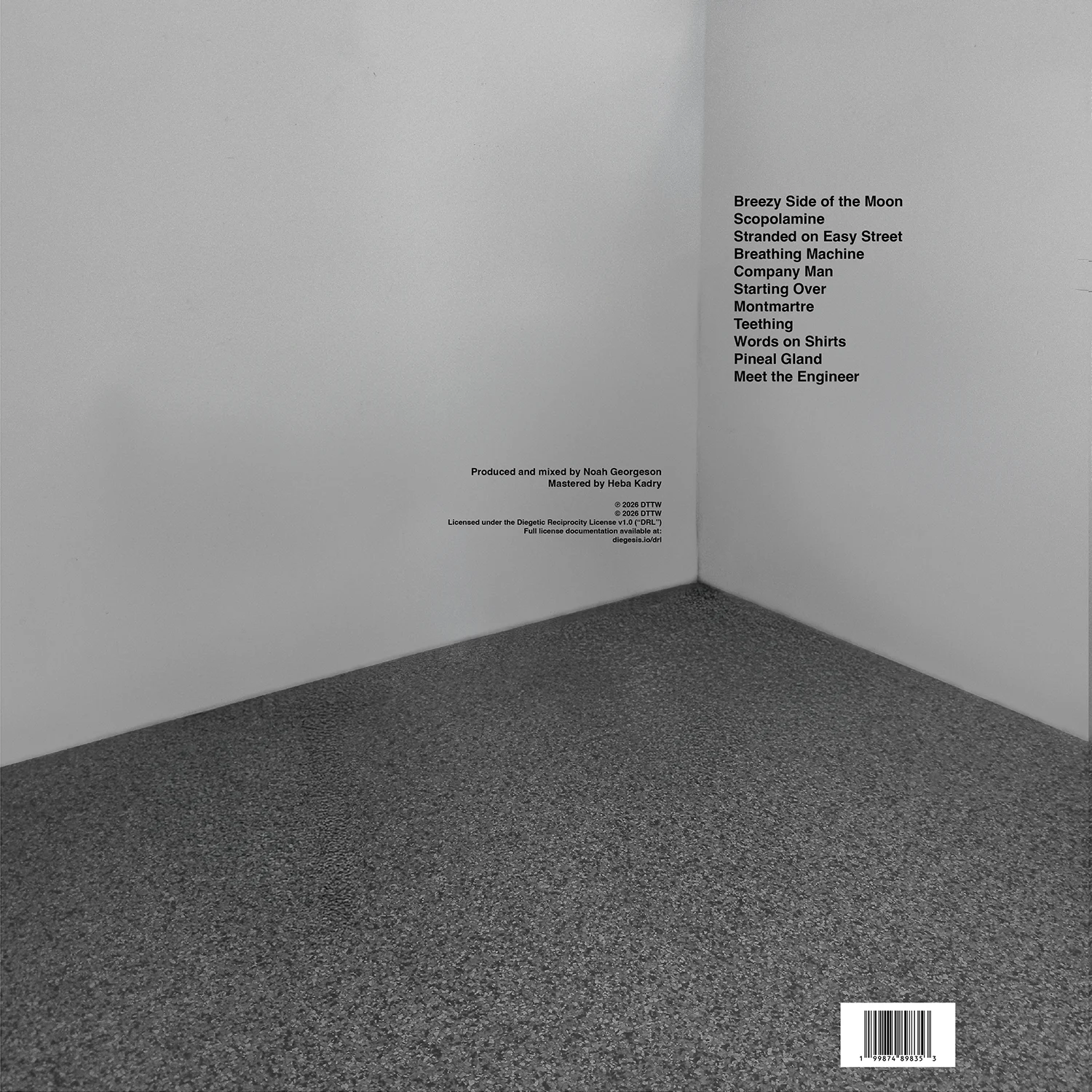
The record jacket had to feel restrained enough to align with the visual identity of the campaign as a whole, but still part of the same thought. To accomplish this, I chose to extend the album artwork image around to the the back of the jacket, creating a mirror image of the space depicted on the front, but empty.
Taking the campaign on the road.
Tour promotion needed to carry the same atmosphere without the restrained aesthetic threatening burnout, each element of the campaign was assigned a slightly varied set of conventions while keeping within the established aesthetic throughline.
Extending the system into motion.
The motion pieces use the same visual rules rather than introducing a separate animation language. Repetition, scale, and simple movement give the Spotify Canvases another way to become slightly implausible.
The campaign never needed a particularly strange collection of ingredients. Most of the work was deciding what to leave normal, what to disturb, and by how much. Keeping the visual language restrained made small disruptions feel larger, and gave the idea enough range to hold interest across an entire album cycle.
Next project / 01
The Yawpers ↗︎